Every now and then I try to break out of my own shell and do something different. This ambition applies to many aspects of my life – food, wines, cars, clothes. More often than not I default back to what I know and what I love. But at least I tried, and often something new is learned, or in fact you learned to trust your instincts a little better.
In photography I seem to do this on an ongoing basis. At times I feel “stuck” heavily using the matte B&W style. So I try different things like color, like 1×1 or other formats, by shooting different subjects. But most of the time I revert back to what I know, what I love or to what I want to better understand. But it is more than that. Even within the confines of the matte B&W form I’m constantly tweaking the formula, experimenting with new controls and settings (currently within my favorite RAW processing app – Iridient Digital).
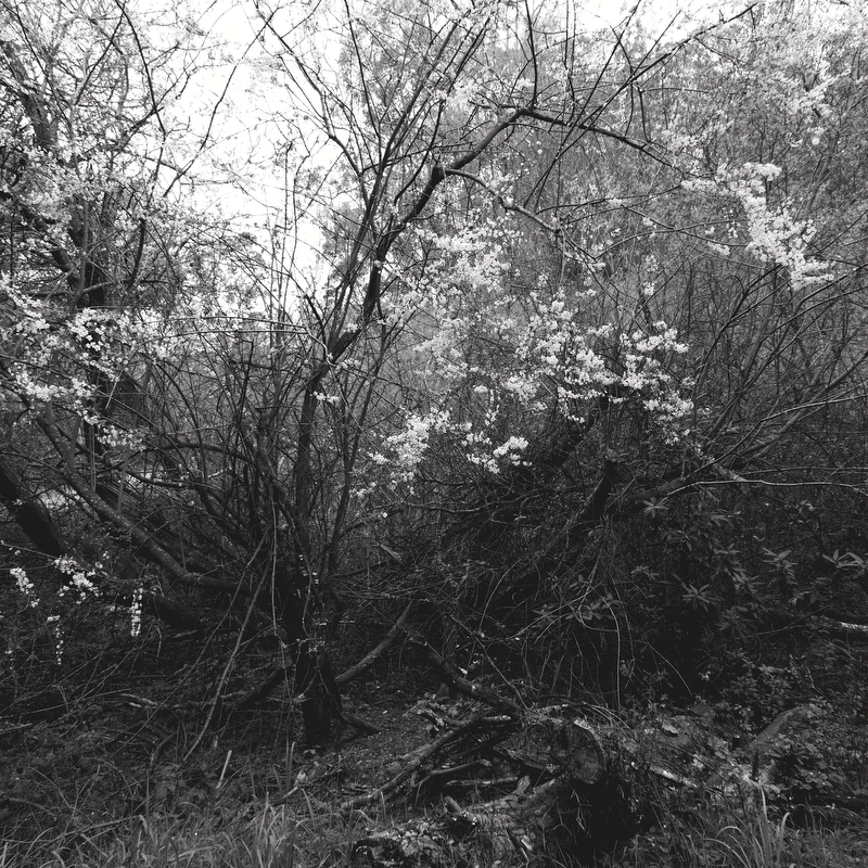
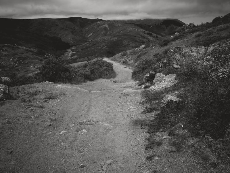
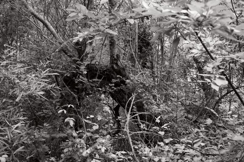
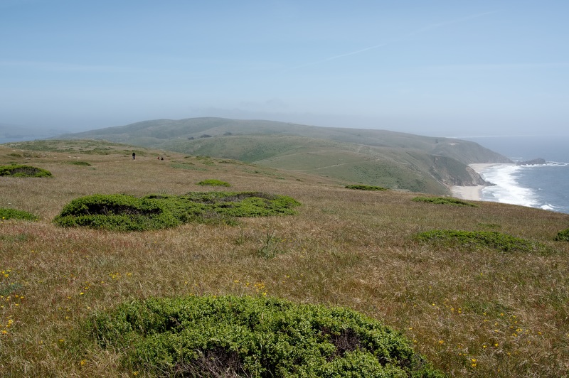
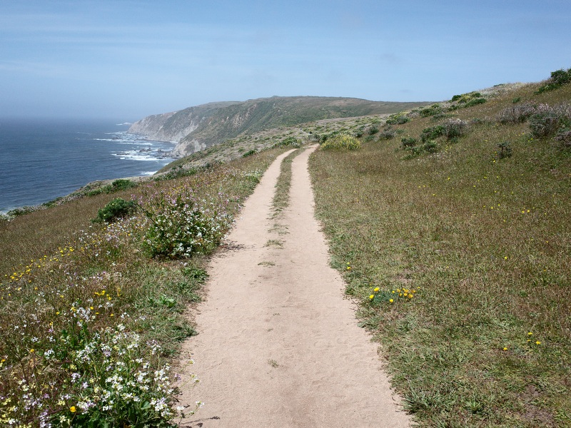
But there are times when I don’t feel the matte B&W formula captures the spirit of the places i typically shoot. It feels unnecessarily restrictive. In some seasons, perhaps in all seasons, color just seems to showcase the wildness and diversity more clearly. More obviously. You get a direct sense for what’s there. And I like those pictures. Color is more difficult than B&W to get “accurate,” but I’ve learned more both about what I like and how to get closer to achieving it.
Yet, still. The color pictures feel too obvious. Too understandable. Too simple, too forgetful, too mundane. Even though they are beautiful the story is not as interesting.
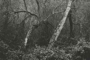
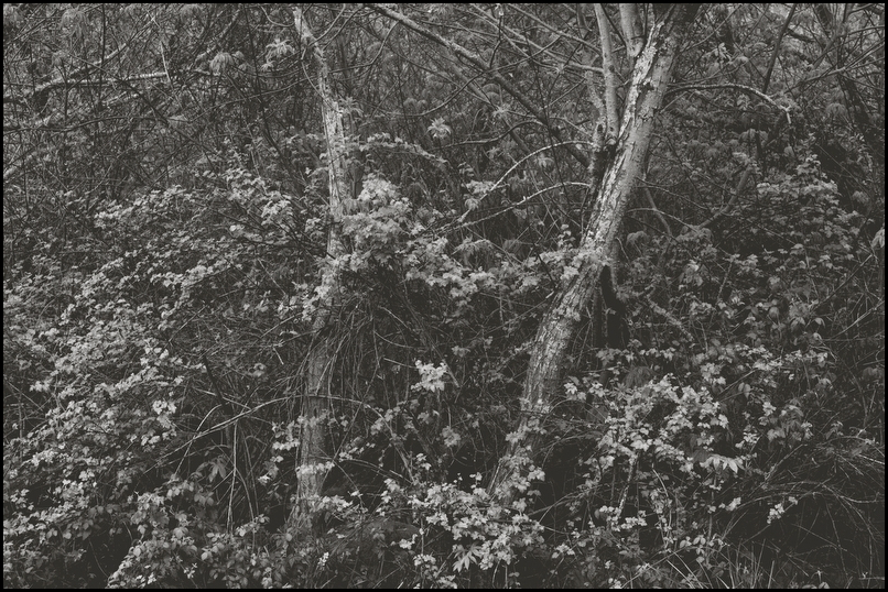
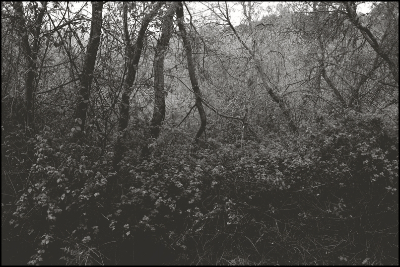
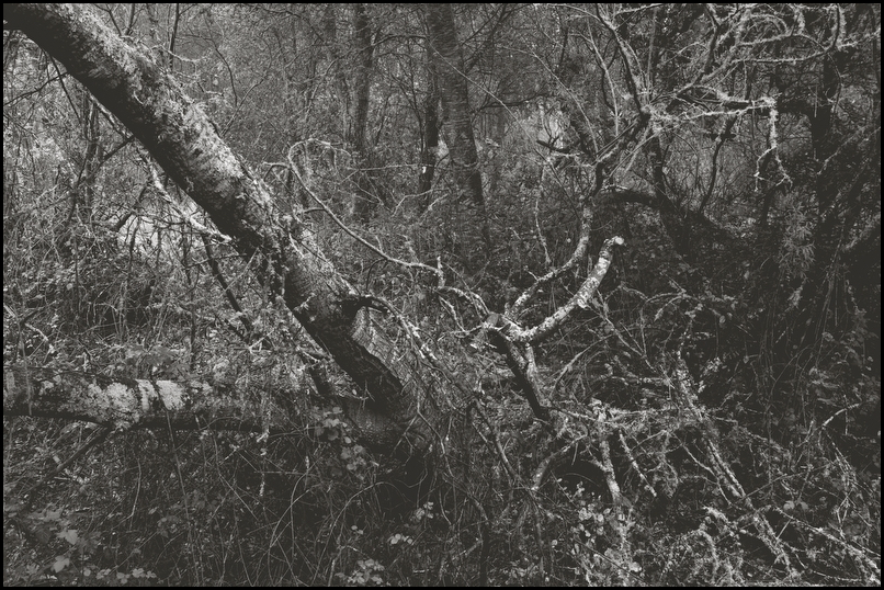
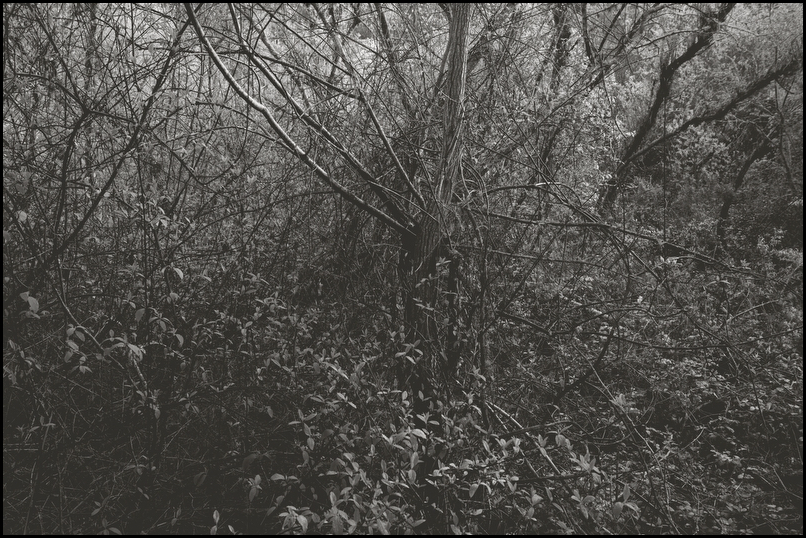
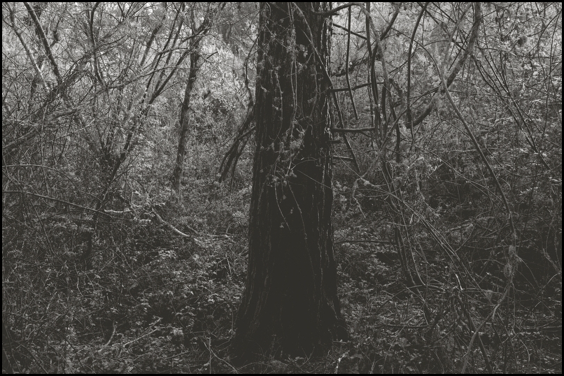
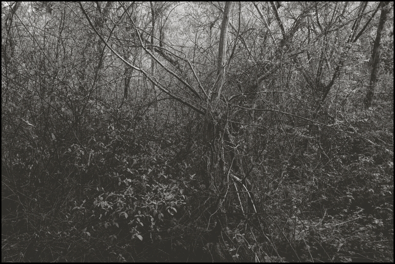
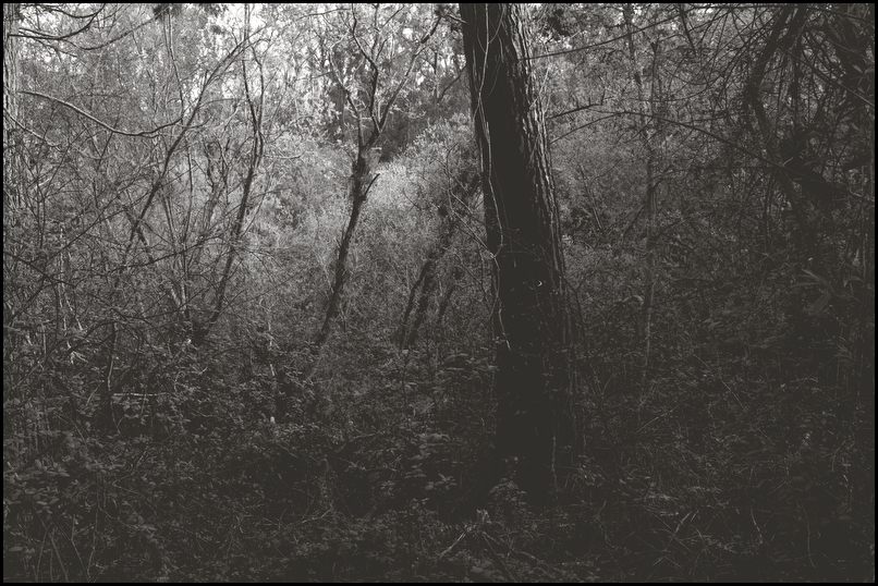
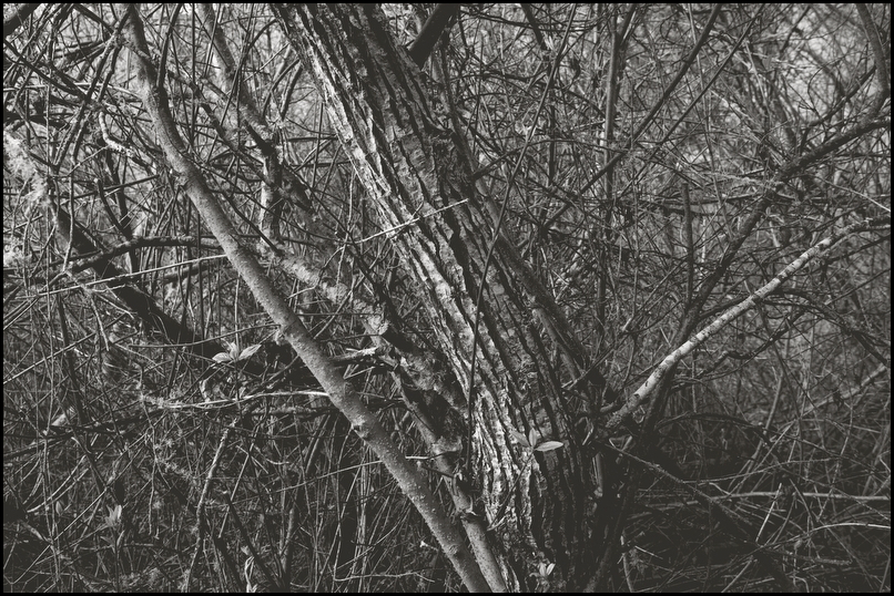
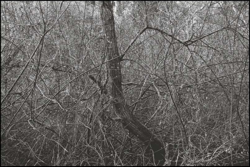
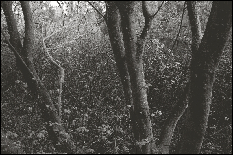
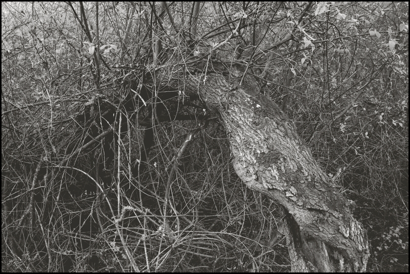
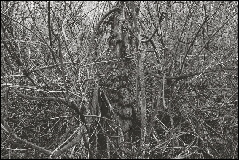
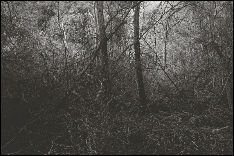
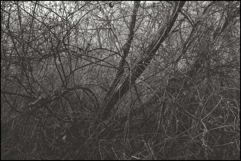
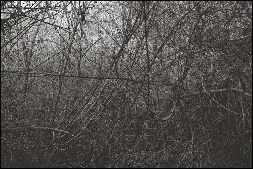
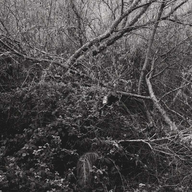
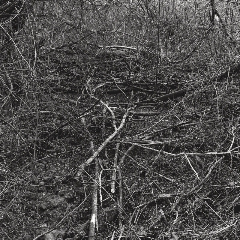
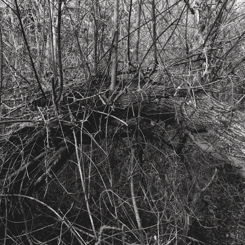
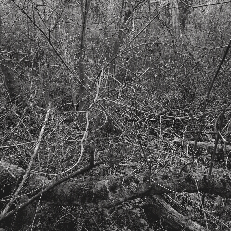
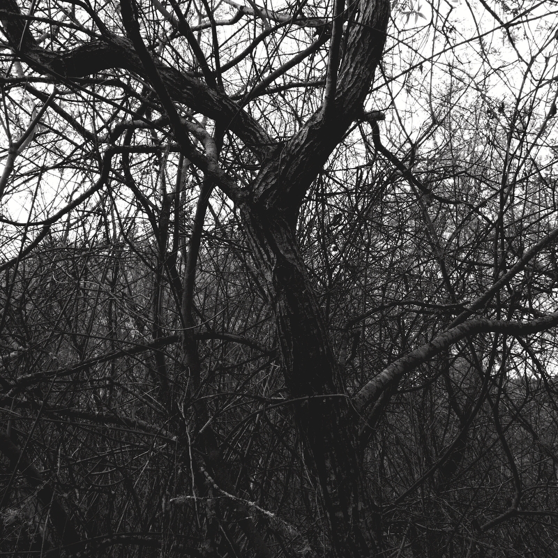
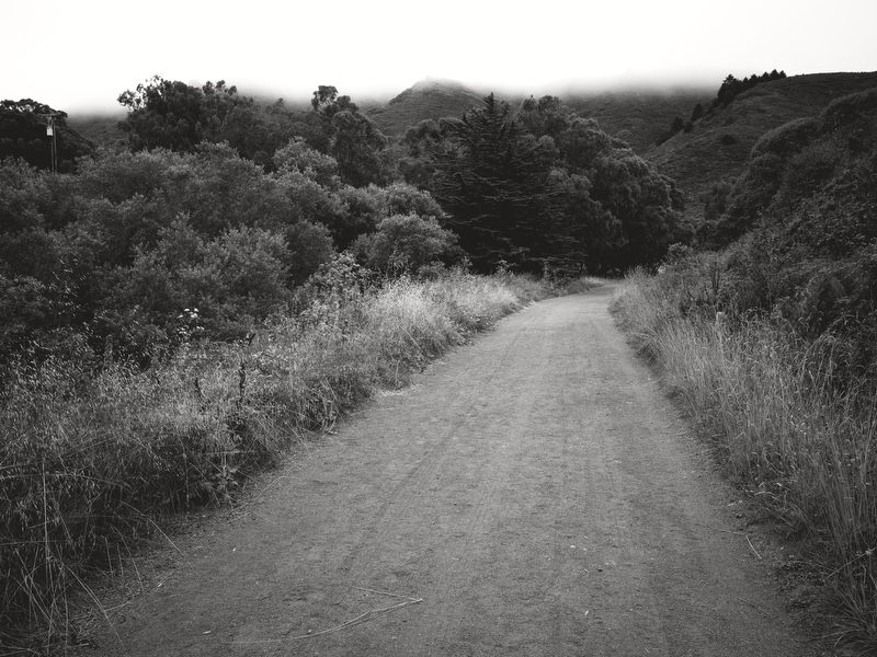
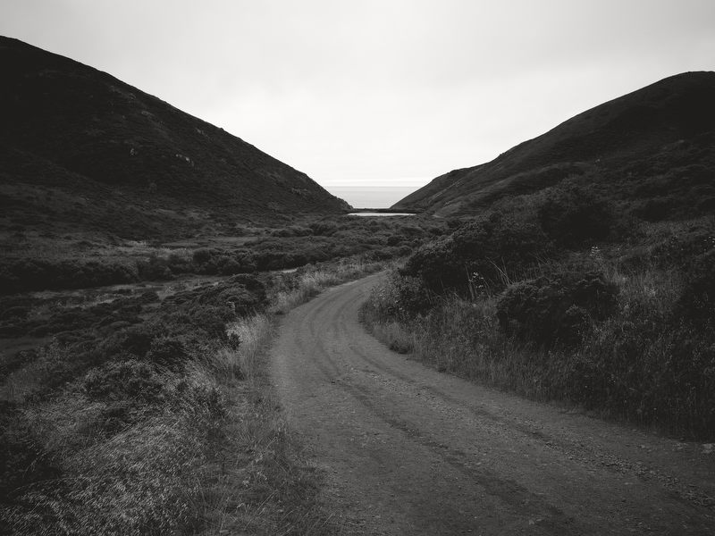
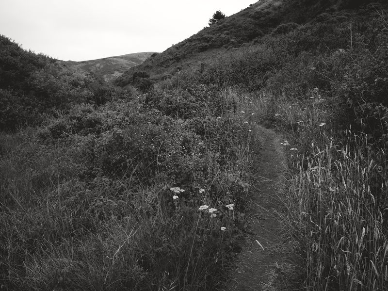
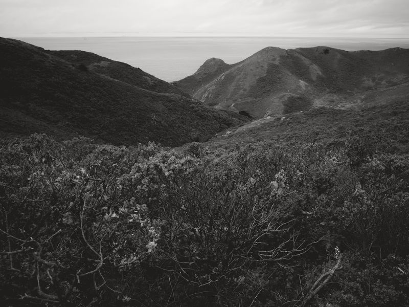
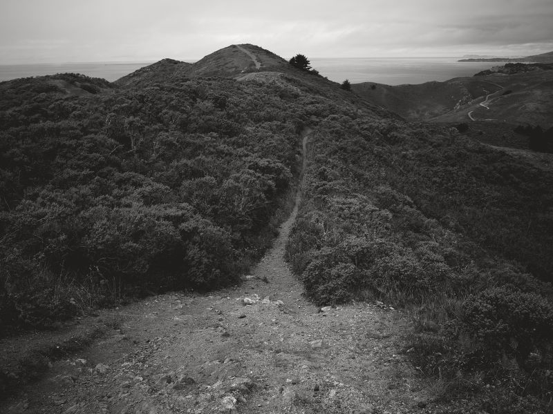
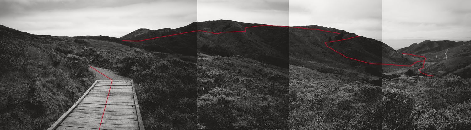
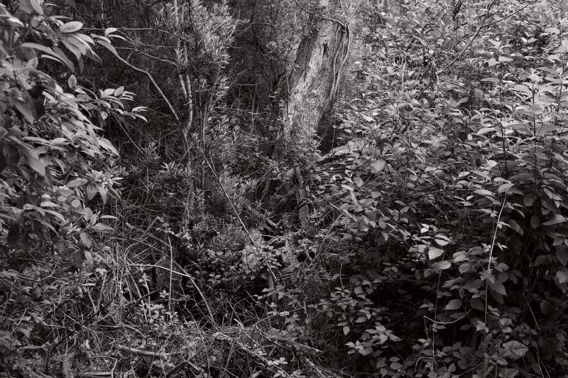
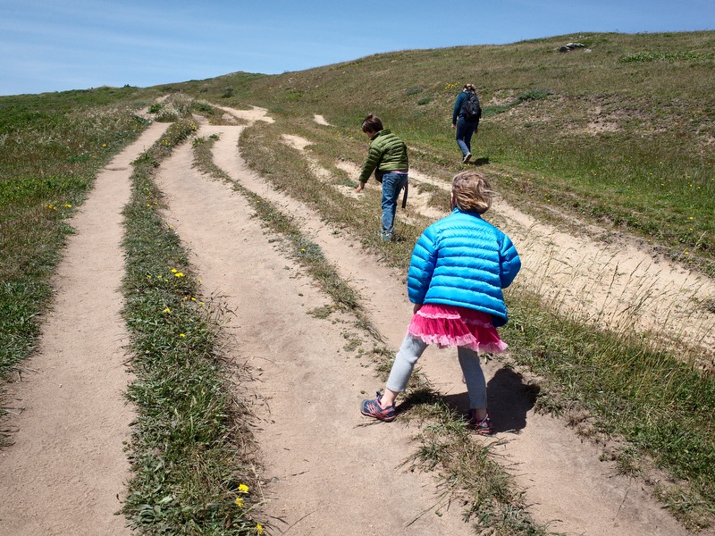
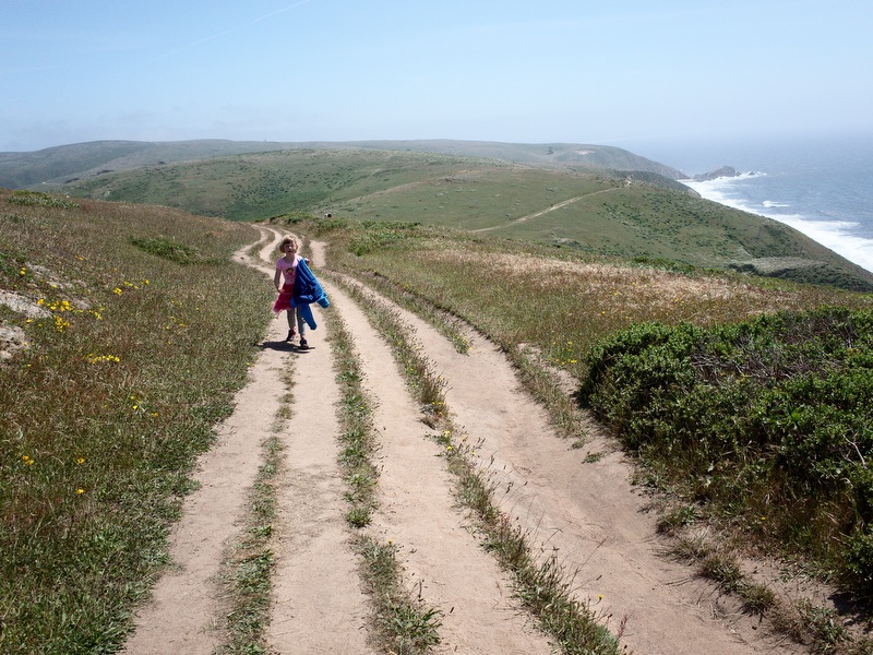
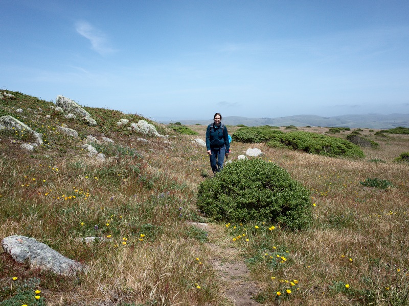
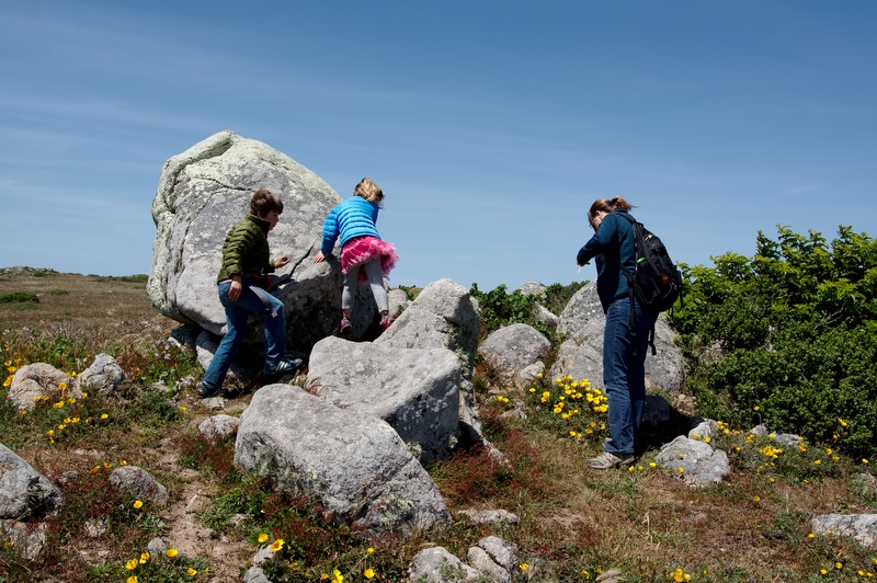
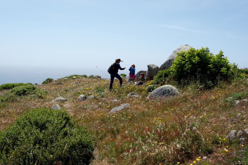
I’ve been working with a series of pictures from a recent Tilden Park walk processing them all as both color and matte B&W. Trying to break out of my shell. But when I flip back and forth between the color and matte B&W versions of each image I almost always prefer the B&W copy. I feel more for the B&W copy. And this is forcing me to think deeper about why.
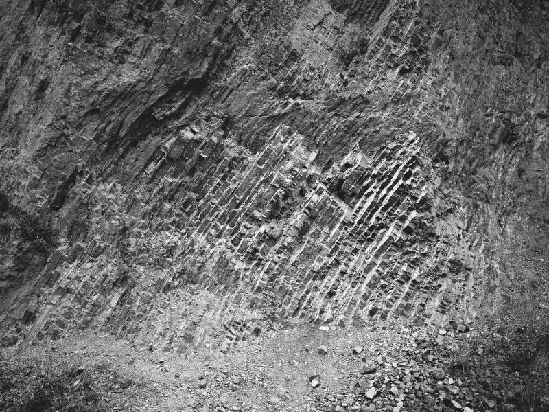
Oddly, I sometimes feel the same way about matte B&W copies vs straight B&W copies. All around, I love B&W photography (in general more so than color). Straight B&W images can be dynamic, denser, more impactful, and contrast can be used to achieve a highly graphical appearance that is appealing.
But the quiet aura of the matte B&W style appeals to me more often than not.
Again, I wonder why. But it really doesn’t matter. I don’t want to remove the mystery from the images, to deconstruct the why until it’s matter of fact. Still, I can’t help but think about this. There is an analytical part of my mind that desires to dig deeper below the wonder of art. I can’t help myself. My software design approach involves the same balance: art and analysis, form and function.
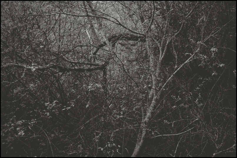
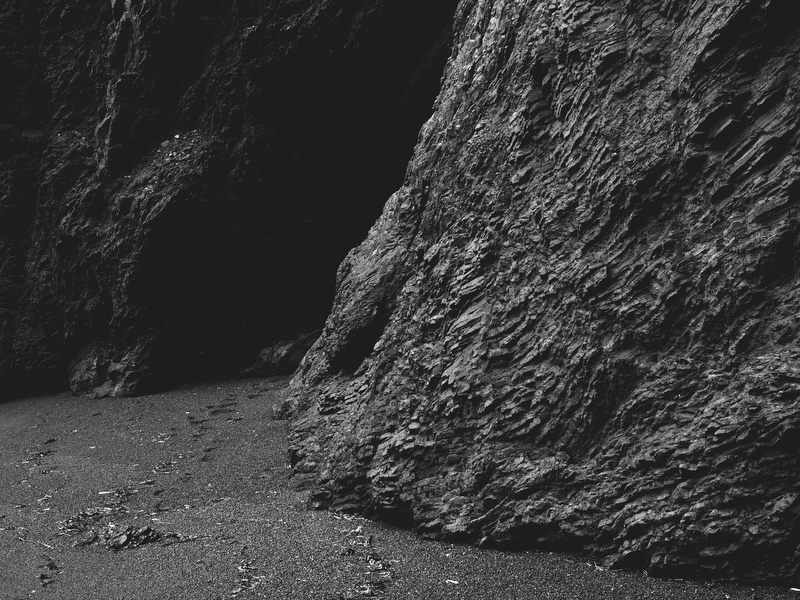
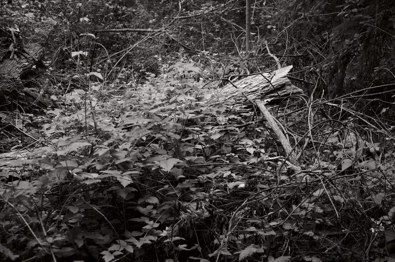
Flipping through those color and B&W pictures I reference above a few “whys” drift in to my awareness. The matte B&W images are more mysterious. There is more uncertainty to them, a reduction in clarity or obviousness or explicitness. They are the same picture and the same subject, but it’s not always obvious what you are looking at. They ask for deeper reflection; I suppose that is intentional.
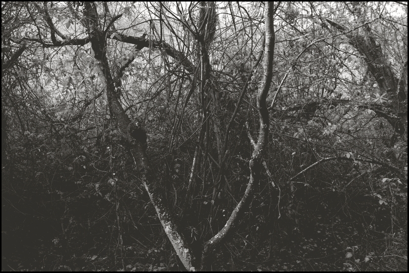
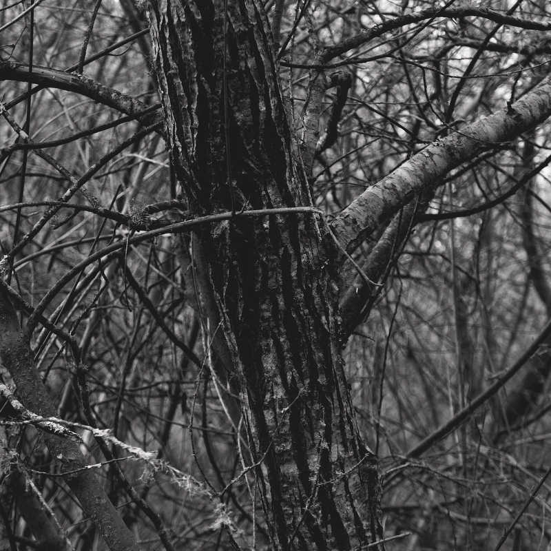
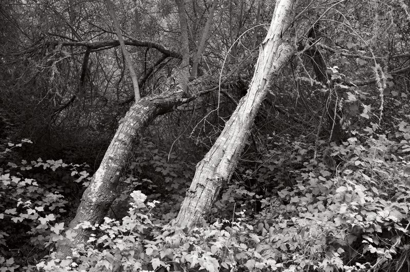
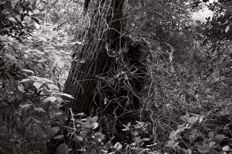
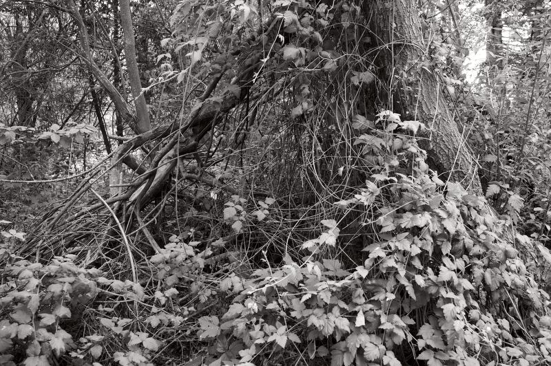
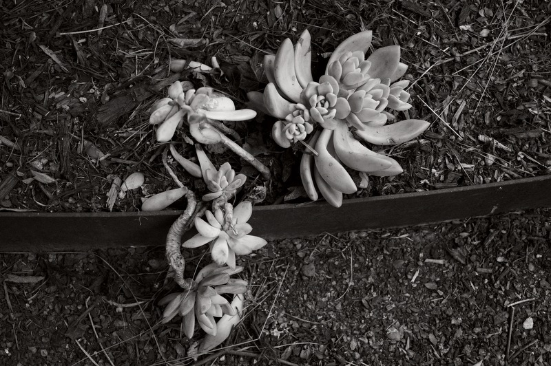
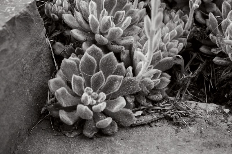
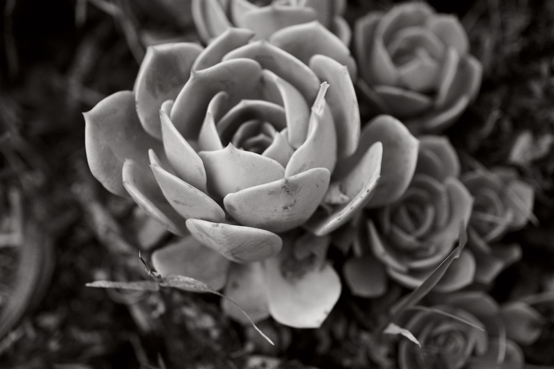
The matte B&W images also resemble pencil drawings, an art form that I love but I’m not yet very familiar with. The gritty, expressive nature of lead pencil marks on textured paper. I believe that is one reason why I prefer to print on textured matte paper; because it augments that character of my pictures. I recently stumbled onto the work of
Sarah Gillespie. At first glance, I assumed she created B&W photographs. However, I was surprised to learn that they are pencil drawings. This, I thought to myself, was where I’d like to go next. Another recent discovery along similar lines is
John Keane’s series Fear. On seeing those images I was inspired to try something new in the future; stay tuned.
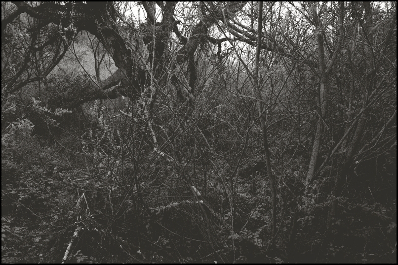
There is also a still, quiet aspect to my matte B&W images, and I sense that that component plays into
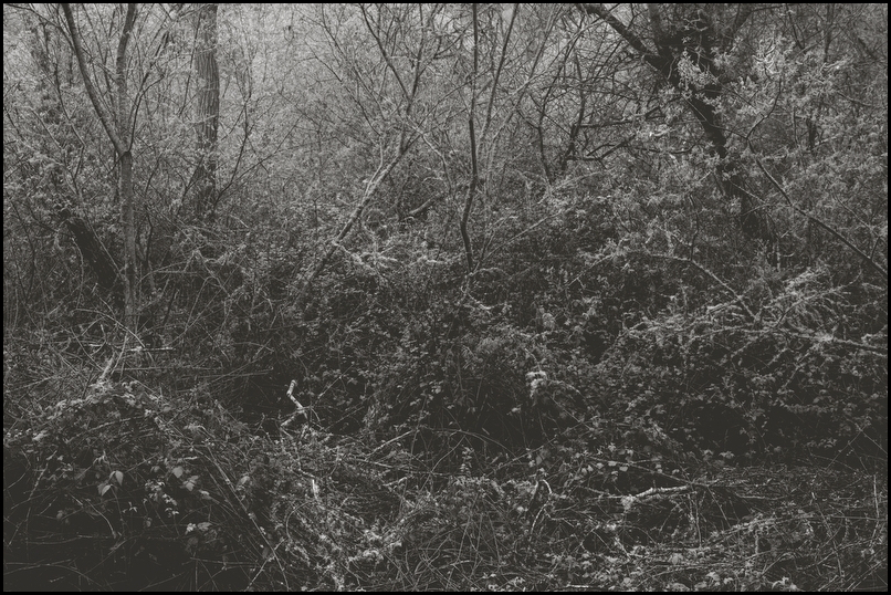
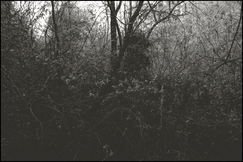
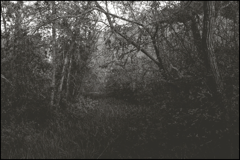
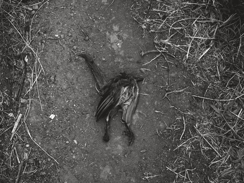
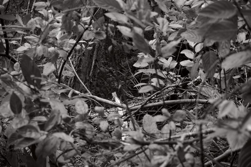
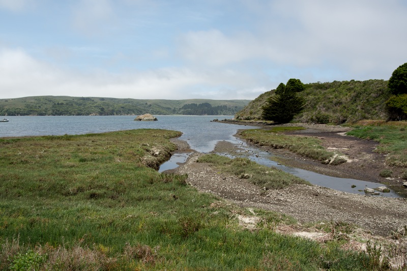
what I see when I walk through those woods. Away from the urban environment surrounded by (semi) wildness filled with quiet or the lyrical sound of birds or other animals. In addition to the quiet of the subject, matte B&W adds a quiet sense of history. Of age, or perhaps timelessness. This component may have to do with the fact that many
older B&W prints have a faded, matte look to them. The blacks dull over time, the whites fade to a lesser vibrancy.
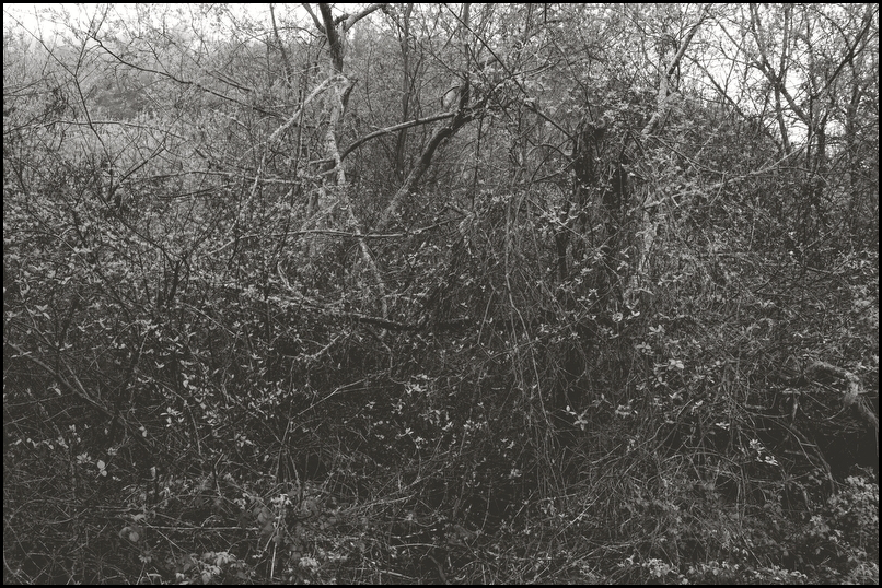
Finally, to my eye, the color pictures and matte B&W images cause you to focus on different subjects within the frame. This will vary from frame to frame, but in general I find that that color pictures draw your eye more directly to specific elements within the frame whereas the matte B&W pictures are more holistic and often allow your eye to wonder on its own or to view the image as one object. Again, this is by no means a universal truth. I have no idea if it is an unconscious intent, but it may be something to think about.
Ironically, to my eyes, the matte B&W style feels less photographic. Of course they are photographs simply processed using apps – in most cases to date I do not do anything else with them. But the matte B&W style seems to remove the pictures one step away from straight photograph (as in the color versions, which feel more direct) and towards something else. Then again, the same argument can be made for virtually any photograph; they are all processed in some way.
But A/B testing the color and matte B&W images by flipping back and forth through them (I have not printed them yet) is not the right way to consider them, and will eventually give you a headache. Like anything that is A/B tested, one affects your sense of the other. The matte B&W image will naturally look dull when viewed right after the color image. Similarly, the color image may look too bold when viewed right after the matte B&W image. This study is best done over time and with prints, with enough time to allow their spirits to soak in. I have no doubt this will be an ongoing debate in my mind, and of course there is no right answer.
I’m still learning how to get the most from my matte B&W pictures. I primarily use curves to achieve the base matte appearance, but the shadows can clump up, lose detail. That does not bother me so much, but even still I’d like to figure out how to preserve detail in deep shades to the extent that, quite literally, a shadow of the subject remains. This becomes a bigger issue when printing, and often times I have to reprocess a picture for printing as opposed to online viewing. The darker sensibility I prefer can end up too dark, too dull in prints, lacking enough vibrancy to activate. That challenge reminds me of the difference between back-lit viewing on an LCD and viewing prints, which reflect light instead of transmitting it.
Some will see the matte B&W appearance as just another “filter” commonly applied in many smart phone camera apps. That is how it started for me, but I felt inherently drawn to it and I deconstructed the settings that were used to create the filters. I’d like to believe that by now I’ve made it my own. That I’ve absorbed it into my work as a natural output of what I see.
We’ll see where it goes over time. There may be more cracks in the shell to come.


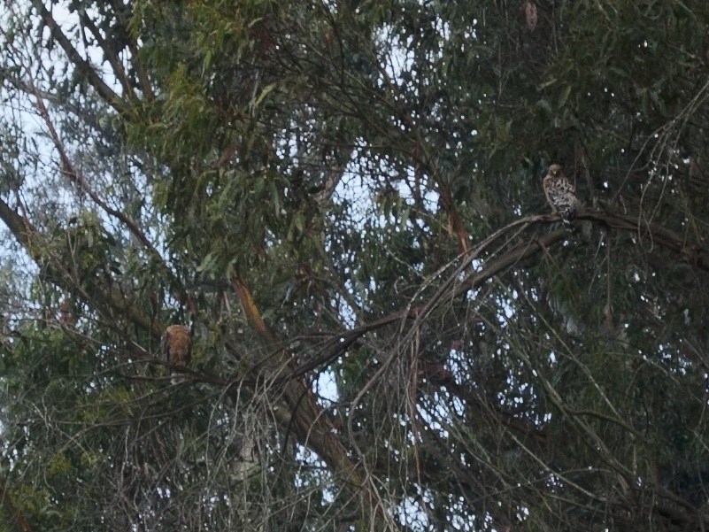
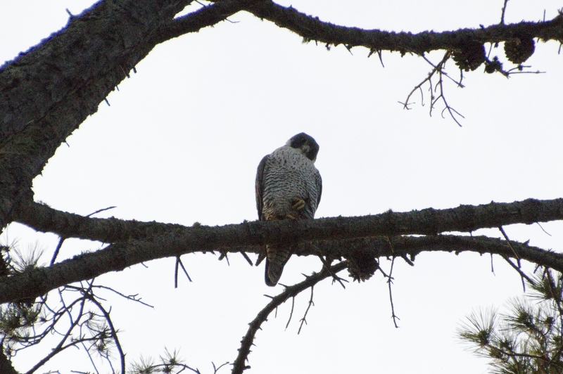


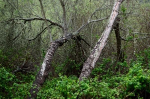
Color Black and White
Every now and then I try to break out of my own shell and do something different. This ambition applies to many aspects of my life – food, wines, cars, clothes. More often than not I default back to what I know and what I love. But at least I tried, and often something new is learned, or in fact you learned to trust your instincts a little better.
In photography I seem to do this on an ongoing basis. At times I feel “stuck” heavily using the matte B&W style. So I try different things like color, like 1×1 or other formats, by shooting different subjects. But most of the time I revert back to what I know, what I love or to what I want to better understand. But it is more than that. Even within the confines of the matte B&W form I’m constantly tweaking the formula, experimenting with new controls and settings (currently within my favorite RAW processing app – Iridient Digital).
But there are times when I don’t feel the matte B&W formula captures the spirit of the places i typically shoot. It feels unnecessarily restrictive. In some seasons, perhaps in all seasons, color just seems to showcase the wildness and diversity more clearly. More obviously. You get a direct sense for what’s there. And I like those pictures. Color is more difficult than B&W to get “accurate,” but I’ve learned more both about what I like and how to get closer to achieving it.
Yet, still. The color pictures feel too obvious. Too understandable. Too simple, too forgetful, too mundane. Even though they are beautiful the story is not as interesting.
Filed under: Commentary, Photography, Thinking About Photography, Tilden Park | Closed
Tags: Thinking About Photography, Tilden Park